Friday, September 27, 2013

Project 2: Work Day one


Today was a very productive day. First off we were assigned groups for project 2. At first I was hesitant about the whole group project, but then as I interacted with my group I realized I was placed with some pretty intelligent and insightful individuals! Which will only make this project that much easier. 

As far as what we worked on, we created a word map for a tape measure to get an idea of how the process will work. We initially listed words that had to do with product and then based off that, sought ways to improve said product. 

Overall we managed to generate some great ideas and it was definitely a step in the right direction. 

Sunday, September 22, 2013

Think + Make Reading 1

After reading the Think + Make reading one it reminded me of why I love design. Design is limitless. It has no boundaries. It's versatility and ever changing form are some of the reasons why design has such a huge impact on the world around us. Everywhere you look, everything around us is a product of design - good or bad. Design is global and is not finite. Design can be a physical arrangement of an object or the characteristics of a task. Another realization that I've come to is that design is the visualization of diversity. Every single person forms a design in one way or another. That diversity in design unveils the beauty in life and we're able to view it from various perspectives.

The next time you go somewhere, take a look around. Tell me what you see. Do you see a building or do you see an architectural achievement? Think about it.


The possibilities are endless.

Don Norman - 3 ways good desing makes you happy

Design critic Don Norman lists the following as 3 ways good design makes you happy:

  1. Viscerally
  2. Behaviorally
  3. Reflectively
How do these three ways make you happy? Lets look at each of these a little more closely.

     Something coming from strong emotions and not from logic or reason. This is an interesting way of thinking. When someone follows their heart or listens to their innate compass as opposed to what is logically sound we refer to this as being visceral. Looking at this from the standpoint of making someone happy, it's easy to connect the dots because normally when we get what we want our way it fills us with joy. That's not to say that it's always the right choice, but it's what pleases us. So by interacting with design by using our emotions - how we feel - compared to just following orders then there's more designer influence and individuality. For example, when drawing, you draw the proportions of an object based on what you see and how big you FEEL that they should be. It's different than if you were tracing the object. There are confined limits to what you can draw, but by drawing freely the object can break those barriers and come to life, making the work unique to your skill.
    
    When Don talks about behavior of design, it's similar in the way of visceral because it has to do with our emotions and what we expect to gain from the object. Like Isaac Newton said, "for every action there is a reaction" and the same applies to the behavior of a design. It's designed to act in a certain fashion that once something happens we expect a certain outcome to follow. This makes it simpler for us because we usually know the outcome. If something unexpected happens such handle breaking off a coffee mug that you just bought then you would be displeased because the object didn't perform to your expectation and that can be upsetting. If the object responds with the same routine outcome each time, then you know that it's well-designed.

     Finally how design is reflective. I believe this has to do with us. We live in a society of "i" everything - the number one focus is ourselves. While this may be disconcerting most of the time, it's become apart of everyday life. When choosing stuff to buy, we look at how well it fits to our needs, how well we'll like it and whether or not it fills a void. In the video, Don says that we buy products simply because of how they will make us look. Whether it's a car or shoes, we care about how things reflect on us. With the example of car buying, the obvious things we look for in the decision-making process are whether or not it's safe, has good fuel-efficiency and adapts to the geographical region you're in. However, a main decision point is in the overall look of it. Why do we care about how something looks? Because we want to be cool! Why do so many people buy things that others have? So they can look cool! Apple products are a good example of this. While the products of Apple are reliable and get the job done, they're also very well-designed, but many people buy them because others have them. This illustrates how certain products act almost as our identity.


Poster-in-Progress

Full design mode: ENGAGE!

 
Essential Supplies - CHECK


Initial Poster Arrangement


Changes to be made to size of product


Shot of object on white surface to be cutout

Dieter Rams - Ten Principles of Good Design

What is Good Design? That question has been the center of our first project and Dieter Rams answer that question with 10 principles that equate to what most of us look for in a well-designed object.


Good Design....

     1. ...is innovative
  • New technology offers new opportunity for innovative design
     2. ..makes a product useful
  • Product can't only be functional, but visually-appealing to our senses
  • Design highlights the usefulness of a product, focusing only on the positive and not on stuff that could detract from it
     3. ...is aesthetic
  • Aesthetic quality of a product is integral to its usefulness because products affect who we are and our well-being
  • Well-executed objects can be beautiful
     4. ...makes a product understandable
  • Clarifies products structure/purpose
  • Should be self-explanatory
     5. ...is unobtrusive
  • Products focus on functionality, not style
  • Design should be neutral, allow for user's self-expression
     6. ...is honest
  • Doesn't make product any more than what it is already capable of it
  • Doesn't manipulate consumer to sell product, but instead lists what product, can or can't do
     7....is long-lasting
  • Avoids being fashionable
  • Focuses on durability and longevity
     8. ...is thorough down to the last detail
  • Nothing left to chance or arbitrary
  • Care and accuracy play crucial role and show respect to user
     9. ...is environmentally-friendly
  • Design contributes to preservation of environment
  • Minimizes physical and visual pollution throughout lifecycle of product
  • Conserves resources
     10. ...is as little design as possible
  • Less is more
  • Concentrates on simplicity and what is essential to product

5 Objects

Here were my 5 objects that I selected for Project 1:


1.) Lamp - I chose this lamp because of it's unique design. As you can see it forms a triangular shape as it slopes up. It also has shelves which come in hand for storing books and other things. Not to mention it illuminates brightly.

 
2.) Bowl - This bowl is another example of an interesting design primarily because of the texture on the exterior. In addition to it's texture is the shape which is a reverse sloping of the lamp. 

 
3.) Mug - Here is my mug which I eventually chose as my primary object. The reason I chose this object was because of it's simplicity, mobility, functionality and relevance. It has a sleek, thin stainless steel design that holds one of the most vital necessities to college life: coffee (or tea...or both)

 
4.) Sunglasses - like the coffee mug, sunglasses are another essential tool for college students mainly because of the trek across campus to classes it aids in blocking out the sun while also maintaining a sensible style. Btw, these are the KU sunglasses.


5.) Can opener - Probably the most interesting choice in my object selection would be the can opener. Not a predictable choice for a well-designed object, but in fact does offer a unique structure that most people tend to overlook. Just like the mug and sunglasses, the can-opener is another tool found in an average college student's dorm.
 

Wednesday, September 18, 2013

Design in the Palm of your Hand


A standard for design nowadays is found none other than in your pocket.
 
Pictured below are the three major operating systems among the mobile market. Apple's iOS7, Windows, and Android.


Below is a comparison between iOS6 (right) & iOS7 (left)
 
 
As you can see there is a major difference between the various versions. The design for Apple's operating system has been pretty stagnant ever since the 2007 birth of the iPhone and since then, they've released updates, but not as drastic as iOS7 which sees a complete design overhaul.
 
Before iOS7, the design was very plain and two-dimensional with the features echoing that same monochromatic tone. iOS7 introduces a brightly lit hues that give it a bubbly look without coming off as cheesy or over-the-top. The new iteration of iOS doesn't invent anything new (most of the features introduced have already been available for Android users), but it does illuminate Apple's darkened composition and will be used for years to come along with nothing but improvements.  
 

Tuesday, September 10, 2013

Color Police - Good Color


This image displays a beautiful sunset upon a waterfront with trees that frame the picture. The warm colored hues of a calm orange break away from the other times harsh reality that is orange. Instead, the subtle orange mixed in the blue water create a very somber ambience.


Here is another image that showcases the best that color combinations have to offer. Limited palette is one of the primary color unity strategies seen in the picture. The various hues of blue nicely compliment each other. Having more of the lighter hue and less of the dark hue is a nice touch that makes this room easy to look at. The balance between the blue and white also give this picture what it needs to help establish a complimentary combination.

Color Police - Bad Color


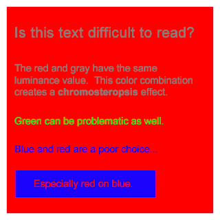
This picture is a prime example of bad color combinations. The chroma count on the image is astronomical and as the text says, makes it problematic to read. While making it hard to read, the different colors in no way complement each other simply because each of their values is too high.  

 
The lack of Similarity and Equality in the design on the sweater creates a very chaotic scene in which case the eye has a hard time trying to find a focal point. None of these color do a good job of complimenting each other nor is the contrast the least bit interesting. See, even Bill Cosby is saddened by a very dull color combination. (On a side note: sweaters FTW)


An era of disastrous color combinations would be the 1970's. Here, the dull, monochromatic burnt orange brown furniture and green mustard carpet create eye sores amongst the plain white walls. To make matters worse is the yellow room in the background. Although it's not prominent, the yellow room adds to the unbalance and instability that this picture is.

Monday, September 2, 2013

Soften the Contrast

More of my favorite images this time from, "Soften the Contrast".


I took this on my last night in San Diego last summer. What a beautiful city.


This is from when I went down to Orange Beach, AL for Spring Break this past year.

As you can tell, there's a reoccurring theme here in the form of vacation..

Keying the Color

Here's some of my favorite pictures from the 24 images. Two of them deal with, "Keying the Color".


 This picture was taken this past summer down in Miami while I was there on vacation.


A bittersweet image. Taken on the flight back from San Diego from Summer 2012.